Tuesday, July 31, 2018

Eh, I Don't Love It

And there are a few reason why.
First, I'm not much of a purple person, but I wanted to practice using my purple Copics, so that's how this ended up being purple.
Second, I colored it on Natural White cardstock, instead of Solar White.  Not that I don't like the cardstock, because I do. . . it's perfect for Copics. But it did dull the colors a bit. I probably should have used warm colors instead of cool.  So, I learned something there.
Third, it's missing something, but I can't seem to find just the right embellishment to throw on there.

Copics used: Roses - C1, C3, C5, BV02, BV04, BV17, Y11, Y13, Y08;
Leaves - YG01, YG03, G07 

So, why am I posting a card that I don't love? Well, I think everyone has a project that they're not happy with and so they don't post it anywhere and I thought, even though I don't like it much, I did learn something and that would be good to share.

Over all, I really like the layout of the card, and I'll probably use it again with a different color palette. And of course, with the Beautiful Flowers stamp set because it's really good for practicing Copics. . . especially, because in addition to the One Layer Wonders class, I'm also taking a Coloring Class with Kit and Clowder.

And there ya have it. . . a card that I don't totally love, but I got good practice coloring, I do love the layout, the stamps are fantastic quality and all of those things are worth posting about.

Thanks for stopping by today!

Sunday, July 29, 2018

One Layer Wonders Day 2

So, I'm really trying to break out of my box, and the One Layer Wonders class has been awesome.  Don't get me wrong, I still love lots of layers and patterned papers, but I'm really starting to like one layer cards.

For Lesson 2, it was all about rainbow backgrounds and making a masked shape stand out.  Here's my card:

{Supplies used are linked in the text and thumbnails in this post.
Compensated affiliate links may be used at no additional cost to you.
Thank you for your support!} 

Now, I didn't have a background stamp that would fit a full card front, so I had to adjust accordingly and use it sideways. Thank goodness for stamp positioners!

Here's what I used:

Neenah Classic Crest Cardstock
Ladybug Memento Dew Drop Ink Pad
Tangelo Memento Dew Drop Ink Pad
Dandelion Memento Dew Drop Ink Pad
Pear Tart Memento Dew Drop Ink Pad
Bahama Blue Memento Dew Drop Ink Pad
Onyx Black VersaFine Ink
Brushstroke Expressions by My Favorite Things
Marrakesh Background stamp by Rubbermoon
Nestabilities Classic Heart Dies
Copic Cool Gray 1
Copic Cool Gray 3
Copic Cool Gray 5

Thanks for visiting today!

Saturday, July 28, 2018

Pure Prairie Spirit Bouquet

This bouquet! So many details. So many fine lines.  I am truly in awe of Marcella Hawley (owner of Power Poppy)!  All of her stamps are hand drawn. . . hand drawn.  I can't even draw a straight line with a ruler!

Anywho . . . here's a card I made using the Pure Prairie Spirit Bouquet stamp set:

Copics used: Sunflowers - YR15, YR18, R59, E23, E27, E25, W1, W2
White Daisies - C1, BV31, BV34, Y11, Y13, Y15
Pink Flowers - C1, C3, RV00, R81, R83, R85, Y13, Y15
Red Flowers at the top - W1, W2, R02, R05, R08
Blue Flower - C1, B0000, B52, B45, C7
Yellow Sprigs - W1, Y11, Y13, Y15
Red Flowers at the bottom - W1, W2, R22, R24, R27
Stems and Leaves - C1, C3, G40, G43, G46
Bouquet Tie - E31, E34, E37, W1

I'm not sure if I chose Kraft and gingham card stock because of the name of the set, or what.  But, there is something organic about Kraft card stock and the word "Prairie" just conjures up visions of gingham tablecloths.  Anyway, when I was working on putting this card together, I knew that I did want to keep layers and patterns to a minimum.  I mean. . .that bouquet is the star of the show here.

I have quite a few Power Poppy stamp sets in my collection.  They stamp beautifully, the detail is incredible and they are perfect for practicing Copics.  If you haven't checked them out, I encourage you to do so. . .they are fabulous stamps!

Thanks for visiting today!

Wednesday, July 25, 2018

BIG Beautiful Flowers

Oh, hey there!  I finally got around to adding little buttons that link to my Instagram, Facebook Page, and Pinterest Board.  See?  Over there . . . to the right.

Little by little, this blog o'mine is coming together.

Okey dokey . . .on to today's card.  This stamp. . . you guys! It is one seriously large stamp and I love it!  Actually, I love the whole set!  My heart was all a-flutter when I saw Jennifer McGuire use it in this video.

The funny thing is, she didn't use the flower stamp at all . . . just one of the sentiments.  But I still had to have the set because of the large flower stamp.  Take a look.  That spray of roses is just breathtaking! Am I right??

Copics used: Roses - W1, W3, W5, R81, R83, R85, R59
Flower Centers - Y11, Y13, Y08; Leaves - C1, C3, YG01, YG03, G07
Now, then. . . I have a confession to make.  I'm addicted to YouTube. It's a recent addiction, and it all started with me looking for Copic tutorials.  I was quite out of practice with my beloved markers, and really needed some guidance and inspiration.

During one of my searches, I came across Kelly Latevola.  (You may recall her name from this post.) She has amazing tips and tricks when it comes to using Copics.  Did you notice that I listed gray markers to color this image?  Well, watch this video and you'll see why.

So, for this card, I used the rose spray and "happy birthday" sentiment from the Beautiful Flowers stamp set by Simon Says stamp.  For the background, I used the Background Trellis 2 Die and Happy Birthday Designer Die from WPlus9.

I have a feeling that I'll be using the stamp set and the background die for a whole lot of cards in the very near future!

So glad you stopped by today!

Monday, July 23, 2018

DIY Distress Ink Storage for Less than $20

Yes, you read that title correctly.  Storage for ALL 60 colors of Distress Ink for less than $20.00.  Of course, there is a little bit of elbow grease involved, but it is definitely worth it.


Now then, before I go into what you need and how to do it, I want to first share with you a few issues that we ran into (and by we, I mean my husband, because he's awesome and actually did all the work).

1. When you go to Michael's, go to the ink isle first and grab a Distress Ink Pad.  You'll see why in just a second.

2. When choosing your crates, make sure they are all the same height.  We didn't do that and ran into quite a issue.


3. After you choose crates that are all the same height, you'll want to make sure that the top and bottom also line up as you are looking down at the interior of the crate. I couldn't figure out how to change the color of the line from white to red when editing the photo, so just be aware that those bold white lines show what I'm talking about. I'm hoping the arrows also make it more clear.


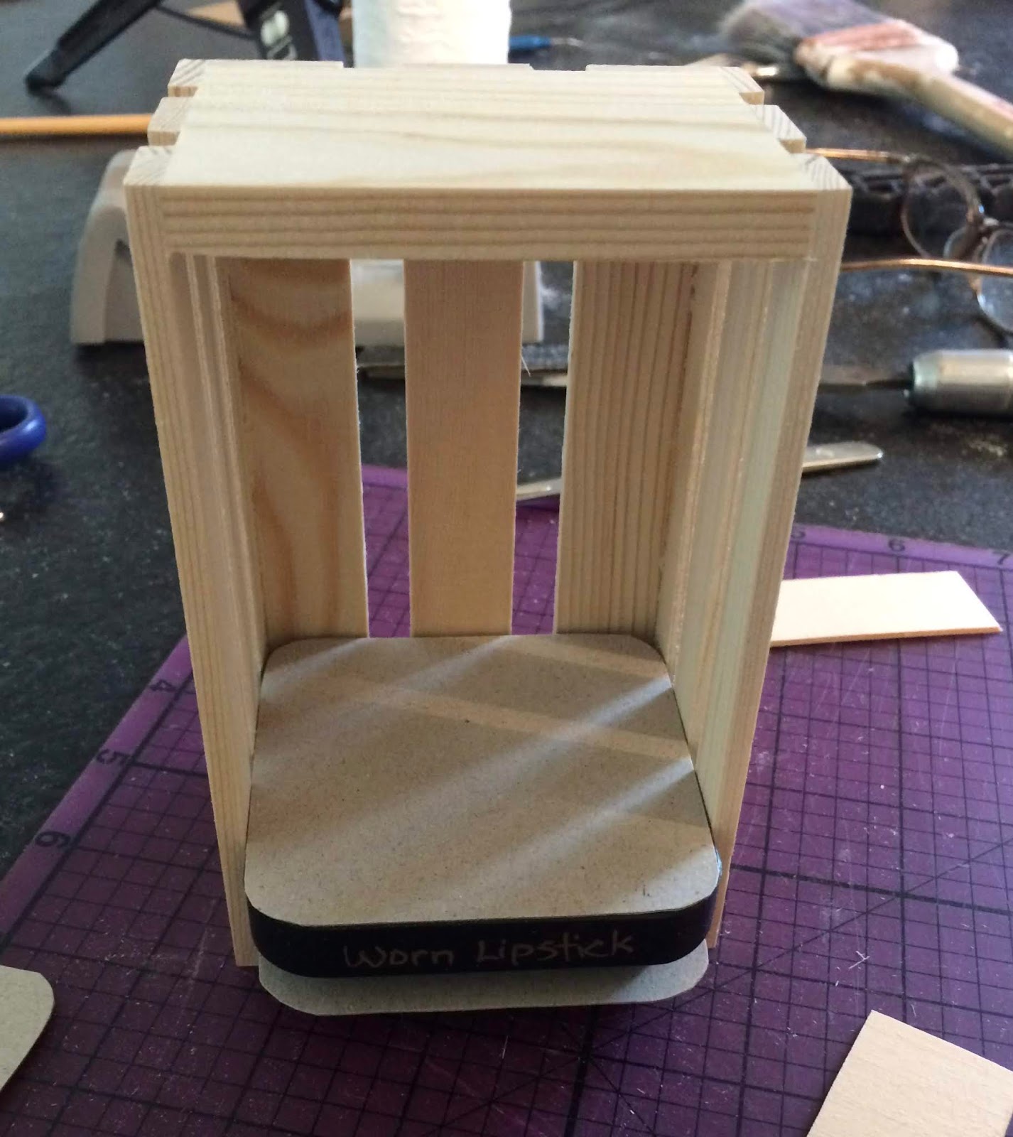
4. And finally, once you have chosen all the crates, place the ink pad in a crate as shown in the photo and make sure you can slide it all the way up to the top.


Okay, on to the good stuff.  Ready?  Here we go!

Supplies needed:
  • Twelve (12) Mini Wood Crates by ArtMinds measuring 5" x 3.13" x 2.63 (available at Michael's for $1.00 each)
  • Two (2) Pieces of Basswood measuring 1/8" x 3" x 24"

  • Pencil
  • Ruler
  • Craft Knife and Cutting Mat
  • Wood Glue
  • Toothpick or some other skinny, pointy thing to apply glue
  • Medium weight chipboard
  • Sandpaper
  • Five (5) Distress Ink Pads (to help place the shelves)
Step 1:
Use the ruler and pencil to draw 1" sections on both pieces of Basswood. 


Step 2:
Use a craft knife or box cutter to cut the Basswood.  You might have to go over the the pencil line a few times to get the wood to cut, but it is pretty easy to do.

Step 3:
You'll need four "spacers" to help place the "shelves."  Trace around an ink pad on the chipboard and cut them out.  They don't have to be perfect, just be sure they don't hang over the edge of the ink pad.


Step 4:
Place one of the chipboard pieces on the bottom of the crate, then an ink pad, then another piece of chipboard.


Step 5:
The shelves should be comfortably snug against the sides of the crate.  If you have difficulty placing it, lightly sand down one side of the shelf.  Then, apply a small amount of wood glue on the short ends of the shelves and carefully place on top of the chipboard.  Be sure not to push the shelf all the way back.  The edges should be lined up with the front of the crate.


Step 6:
Place a piece of chipboard on top of the shelf, then another ink pad, and another piece of chipboard.  Glue in another shelf.

***Important note: Before placing the chipboard on the shelf, make sure there isn't any glue for it to stick to.  The chipboard pieces are just "spacers" and need to be removed.***

Step 7:
Carefully remove the chipboard pieces from the bottom, leaving the ink pad in place.  Use these chipboard pieces to repeat the steps to add two more shelves.

Each crate will have four shelves and can hold five Distress Ink Pads.


And there ya have it!  Storage for 60 Distress Ink Pads for less than $20.00!

If you have any questions, feel free to reach out.

Thanks for stopping by today!

Saturday, July 21, 2018

My (Not Quite) One Layer Wonder Card

It's no secret that I struggle with creating one layer cards.  I love lots and lots of layers and using different patterned papers.

So, I decided to take the One Layer Wonders online class through Altenew Academy.

Kelly Latevola is the instructor and she creates Ah-mazing one layer cards that have so much dimension.  I also love the fact that it's self-paced and I can complete the lessons at my leisure.

Here's my card from Lesson One:

{Supplies used are linked in the text in this post.
Compensated affiliate links may be used at no additional cost to you.
Thank you for your support!} 

Copics Used: Flowers - Y11, Y13; Leaves - YG03, BG57
Border - BG49, C1, C3, C5
Um. . . it's not exactly one layer.  I had a brilliant idea to stamp the word Happy from the Half-Tone Happy set in a bright yellow ink and it would've worked perfectly except that . . . ahem . . . I didn't clean my stamp very well from the last time I used it so,  yeah. . . that didn't work out so well.

But, I refused to scrap the whole thing and start over, so I compromised and added a white strip to cover my mistake.  And it worked out just fine.

Here are the products I used:

Beautiful Day stamp set by Altenew
Half-Tone Happy stamp & die bundle by Altenew
Teal Zeal Memento Ink
Neenah Solar White 80 lb. Cardstock

Thanks for stopping by today!

Monday, July 16, 2018

Martinis and Golf

Or, a Golf Martini.  I made this card for our neighbor's birthday.  He's been practicing his golf swing in the field behind our house, so I thought this stamp would be perfect to use.

The stamp is by Impression Obsession. . . and there are a bunch of different themed Martinis, and Margaritas, too!  They are so unique in design.

{Supplies used are linked in the thumbnails at the end of this post.
Compensated affiliate links may be used at no additional cost to you.
Thank you for your support!}

After I stamped and colored the image, I lightly sponged some Desert Sand Memento ink around the martini to dull the bright white card stock a bit.  I inked the edges of the ovals and the fishtail banner with Vintage Photo Distress ink.

Thanks for stopping by today!

Friday, July 13, 2018

Hello Gnome

Doesn't this little guy just make you smile? This stamp is Gnome Bouquet by Stamping Bella and there's a coordinating die, as well.

Copics used: Flowers - C1, C3, C5, Y11, Y13, Y15, YG03
Gnome Hat - R24, R27, R29; Gnome Face - E50, E51, E53;
Beard - W0, W1, W3
I used Squeezed Lemonade, Wild Honey, and Abandoned Coral Distress Oxide Inks to create the background.  I die-cut "hello" three times from white cardstock and stacked them for dimension.  To add some sparkle, I went over the die cut with a Wink of Stella glitter pen.

Thanks for visiting today!


Tuesday, July 10, 2018

Sitting in the Clouds

Oh, hi!  I'm still loving those dragon stamps! So, here's another card featuring those cute little dudes.

{Supplies used are linked in the text of this post and in the thumbnails at the end.
Compensated affiliate links may be used at no additional cost to you.
Thank you for your support!} 

I'm excited that I finally got the Stitched Cloud Edges by My Favorite Things.  They can be used with so many things!

For this card, I used them with the Magical Dragons stamps (and coordinating dies) because dragons should totally be sitting in the clouds, right??

I stamped the dragons onto Neenah Classic Crest Card Stock using Memento Tuxedo Black ink and then colored them with Copic Markers.

For their bodies, I used V12, V15, and V17.
For their Horns, Wings, Tummies, and Spikes, I used Y21, Y26, and Y11
For their Claws, I used W2

Stay tuned for more cards using the cloud dies!

Thanks for visiting today!

Saturday, July 7, 2018

Bess is Back

I decided to make another card using Bess the Butterfly with a totally different color palette this time.  I also used a past card sketch from My Favorite Things.

{Supplies used are linked in the text and thumbnails in this post.
Compensated affiliate links may be used at no additional cost to you.
Thank you for your support!}


I started by stamping Bess onto Neenah Solar White Cardstock and colored her with my Copics:

Dress: Y11, Y13, Y15 and Y08
Wing: BG10, BG23, YG00, YG01, YG03, Y21, Y13, and Y11
Flowers: I used Y11, Y21, and Y38
Skin: E50, E51, E53, R00
Hair: E23, E33, E35, E25, E27
Shoe: C5

The polka dot paper is from Memory Box that has been in my stash forever. One really good thing about creating so much is that I am definitely using up my paper!  The striped paper is from My Favorite Things.  I love their patterned paper!

I created the square frame using Classic Square Nestabilities and Classic Scalloped Square dies by Spellbinders.

I put it all together and Viola! It's a card!

Thanks for visiting today!

Wednesday, July 4, 2018

Happy 4th of July!

I hope your day is filled with family, friends and good food!  And of course, a spectacular fireworks display.

Here are three cards that I created for some very special Littles in my life:


Background created with Faded Jeans, Broken China, and
Salty Ocean Distress Oxide Inks
Fireworks stamped in Platinum Planet Brilliance Ink

Copics used: Hats & Flags - R24, R27, R29, B18, B37, C1, C3
Bear - E31, E34, E35, E37, R00, R20
Vest - B18, B37, C1; Wagon - R24, R27, R29, C1, C3, C5, C7
Turtle - YG91, YG93, YG63; Turtle Shell - E41, E42, E43, E31, E35, E99
Ground - C1, C3, Colorless Blender

Fireworks stamped in Festive Berries Distress Ink & Faded Jeans Distress Oxide Ink
Copics used: TNT Box - #23, E27, E29; Fireworks - R24, R27, R29,
B0000, B34, B37, Y13, C1, C3, C5; Shadow - C1, C3
Thanks for stopping by today!

Sunday, July 1, 2018

Birthday Fly-by

In addition to the incredibly super cute stamps that My Favorite Things has to offer, they also have a resource page with all of the challenge sketches.  I love sketches.  And MFT has some really great ones!

Case in point, this card was inspired by Sketch #369.

{Supplies used are linked in the thumbnails at the end of this post.
Compensated affiliate links may be used at no additional cost to you.
Thank you for your support!}

I stamped the dragon onto Neenah Classic Crest Cardstock and colored him with Copics:

Dragon body - BG13, BG15, BG23, BG49
Horns, Wings, Spikes and Belly - Y11, Y13, Y15, YR24
Claws - W2

Then I cut him out using the coordinating die.

I sponged Tumbled Glass Distress Ink using a cloud stencil on a white panel and adhered that to the card front.

Next I used Classic Circles Die by Spellbinders to cut a frame from the patterned paper.  I used foam tape to pop up the patterned paper and that darling dragon.  

I stamped the sentiment onto white card stock and cut it out using the fishtail banner from the Blueprints 2 Die-namics set.  I added a few sequins for a little bit of bling and Bingo! It's a card.

Do you use sketches when you're making cards? If you do, where is your favorite place to find them?

Thanks for stopping by today
10