Wednesday, August 29, 2018

Glittery Goodness

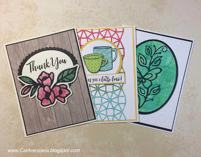
Oh, hi!  I'm back with not one. . . not two. . . but 3 cards today!  I had a grand time playing with some new dies AND glitter AND Copics AND Alcohol Ink.  By the time I was done, I was a sparkly, inky mess.
{Supplies used are linked in the text in this post.
Compensated affiliate links may be used at no additional cost to you.
Thank you for your support!} 
Oh. . .and there's a video showing how I got all that glittery goodness, too!  Yep!  I finally got set up to do craft videos.  I'm pretty excited about that!  So, if you have 14 minutes and 8 seconds, please check it out and let me know what you think.  Feedback would greatly be appreciated being that this is my first video and all.


Ok . . on to the cards.  For all three cards I used Cool Diamond Silk Microfine Glitter and Double-Sided Adhesive Sheets by Elizabeth Craft Designs.


For the card above, I used the Lovely Lilacs Die by Spellbinders.  I love that it's a set of two dies because it makes it super easy to get all that glittery goodness.

After I glittered it up, I added color using R81, R83, R85 and G46 Copic Markers.  Then I cut an oval from Natural White Neenah card stock using my Large Classic Ovals Nestabilities and adhered that to a black scalloped oval that I cut using Fancy Edged Ovals dies.  The sentiment is from the Brushstroke Expressions set by My Favorite Things.

I used foam tape to pop up the flowers and the ovals on a panel of patterned paper, then adhered that to a black panel, and finally, added that to a top folding card from the same Natural White Neenah card stock.  Viola!  All done.

For the second card, I decided to try Tim Holtz Alcohol inks.  I figured if Copics worked, then they should too.  Ta-Da!  They do!


For this card, I used the Wagon Wheel Kaleidoscope die by Spellbinders.  I glittered it up and then applied Watermelon, Butterscotch, Meadow, and Aqua Alcohol Inks.  I adhered that to a white panel using Tombow Multi Mono Liquid Glue.

Those coffee cups are from the August My Monthly Hero* kit from Hero Arts.  I stamped them onto patterned paper and then cut them out.  I adhered the bigger mug onto a white circle using a tape runner.  Then I used foam tape for the smaller mug.  I thought the white circle needed a border, so I cut a circle from yellow card stock.

The sentiment is stamped on white card stock and I added a yellow frame to match the circle.  I used foam tape to adhere the circles and the sentiment on top of the Wagon Wheel die.  Then I adhered that to a yellow panel, and finally onto a white top folding card.  Ta-Da!  Finito!

*The August My Monthly Hero kit is already sold out, but these coffee stamps or these coffee stamps would work well, too.*

For the third card, I thought I'd try Copic Refills.  Lo and behold! They worked too!


For this card, I cut a black frame using Oval Dies from Spellbinders. For the glittered oval, I used the larger of the two oval dies.  The Bellina Butterfly Stem die is from Poppy Stamps.  I love how delicate it is.

I used G02 and BG34 Copic Refills and applied it using an Alcohol Ink Applicator Tool.  Easy Peasy, Quick and Easy!  I adhered the glittered oval to a white panel that was embossed with a Cuttlebug Folder.  Then adhered that to a black panel and finally, a white top folding card.  Viola!  All done.

And there ya have it!  Three cards full of glittery goodness!

Thanks for stopping by today!

Tuesday, August 28, 2018

Wonderful Florals - Bits & Pieces

Howdy!  I'm back with two more cards using the Wonderful Florals set by Concord & 9th.  This time, I focused on using the "bits and pieces" stamps that are part of the set.

I don't know about you, but I tend to overlook those stamps, especially when there is a really good focal point stamp in a set.

Anywho. . . . onto the cards.  The first one is pretty quick and easy to make.

{Supplies used are linked in the text in this post.
Compensated affiliate links may be used at no additional cost to you.
Thank you for your support!} 
I started by stamping the flowers and leaves on a diagonal on a piece of Solar White card stock.  I did do some masking, too.  Then, I colored them up with Copics.  For the flowers, I used R81, R83, and R85.  For the leaves, I used YG01, YG17, and YG25.

After I finished coloring, I put the masks back in place and inked up the Diagonal Stripes Background stamp by Gina K Designs with Pear Tart Memento Ink.  I stamped it once and then turned the stamp 90*, re-inked it and stamped it again to create a plaid background.  That was a little trick I learned by watching one of her videos on YouTube.  Genius, if you ask me!

To add a bit of shadow under the flowers, I sponged some some Pear Tart ink underneath them.  And then I decided to add a drop shadow using C1 and C3 Copic markers.  I also decided to ink all the edges with Pear Tart ink to separate the panel from the card base.

Finally, I stamped the sentiment from the Brushstroke Expressions set by My Favorite Things using Onyx Black VersaFine ink and added a few pink sequins for some sparkle.  And, since i just got a new White Gelly Roll pen, I added dots to the flower centers.  I adhered that to a white card base, and Viola!  All done.

For the second card, I started by stamping the flowers and leaves in the center of a Solar White panel using Tuxedo Black Memento Ink.  Then I colored up the flowers using Y00, Y02, Y06, Y08, YR00, YR15, YR16, and YR18.  The leaves were colored using YG01, YG17, and YG25.


I decided to add a frame around the flowers, so I used a ruler and a black Faber-Castell Pitt pen.  I've come to the conclusion that all rulers hate me.  I could NOT get those lines straight.  But I digress. . . 

Anywho, after drawing a less than perfect frame, I used a couple of Post-It notes to mask the center part and started stamping the background using the little striped square stamp in the set.  I did use a stamp positioner for this and it did take some time because, Whew! I really had to think about where to place that stamp.  BUT, I'm really happy with the background.

I adhered the stamped panel to a black panel and then onto a white card base.

And there ya have it!  Two cards using the "bits and pieces."

Thanks for visiting today!

Sunday, August 26, 2018

A Latte Love

Oh, hello!  So, have you seen the August My Monthly Hero kit?  Dude!  It's all about coffee!  I used to be quite the coffee drinker . . . all day, every day.  Not so much anymore, but I do love a good coffee stamp set.  And this one has it all.

{Supplies used are linked in the text in this post.
Compensated affiliate links may be used at no additional cost to you.
Thank you for your support!} 
For this card, I stamped the coffee cup using Rich Cocoa Memento ink onto the tea-dyed paper that came with the kit.  I thought it would be a perfect pattern for that cup.  I colored the coffee using E25 and E27 Copic Markers and added the highlights using a White Gel Pen.  Then, I fussy cut the image with scissors.

Now then, that tea-dyed paper is pretty fragile, so to beef it up a bit, I used the coordinating coffee cup die and cut it twice from Neenah Solar White card stock.  I adhered the stamped image to the die cut coffee cups and viola! Nice and sturdy.

I stamped the steam using Brushed Corduroy Distress Ink on a scrap of Neenah Natural White card stock, used the coordinating die to cut it out and adhered it to the back of the cup.

I used my Standard Circle Nestabilities to cut a circle, also from Neenah Natural White card stock. I adhered that to a scalloped circle cut from Kraft card stock and used foam tape to adhere the coffee cup and steam.

The patterned paper panel is from a stack that has been living in my studio for quite some time.  But seriously, you guys, it's perfect with all the coffee stains on it . . . or, I suppose they could be tea stains.

I added ribbon, which also came with the kit by the way, to cover up where the two patterned pieces meet.  I mounted that onto a piece of 4 1/8" x 5 3/8" Kraft card stock, and added that to the card base, which is also Natural white, because Solar White was just too stark for this card.

Finally, I adhered the circles with the coffee cup to the card with foam tape (because one can never use too much of that stuff) and then stamped the sentiment using Jumbo Java VersaMagic ink.

And there ya have it!

Thanks so much for visiting today!

Tuesday, August 21, 2018

Wonderful Florals - Watercolored

Well, Hello!  I'm back with two more cards using Wonderful Florals by Concord & 9th.  This time with a technique that is not one of my strengths - watercoloring.

It is something that I love the look of, but being a Type A personality and all, I have a hard time with just letting the water do what it will.  So I tend to overwork it to death.  It is something that I'm working on and will continue practicing.

So, for the first card, I just decided to create a wash of color for a background.  To do that, I used Canson Watercolor card stock and Distress Inks.

{Supplies used are linked in the text in this post.
Compensated affiliate links may be used at no additional cost to you.
Thank you for your support!} 

I taped the cardstock down to my craft mat.  Then I smooshed Evergreen Bough, Peacock Feathers, and Forest Moss Distress Ink onto my craft mat.  I took a wide flat brush and applied clean water over the surface of the watercolor paper. Next, I picked up some of the Evergreen Bough Distress ink and applied it to the top of the card stock.  I followed that with the Peacock Feathers and finally the Forest Moss.

I splattered some clean water to break up the background a bit and then decided to splatter some Perfect Pearls to add a little bit of sparkly goodness.

Once it was completely dry, I stamped the big image using VersaFine Onyx Black Ink.  I did use a stamp positioner and stamped it twice to get those bold black lines.  Once the ink was dry, I added white highlights to the flower centers and then heat embossed the sentiments with white embossing power onto black cardstock.  After cutting them into little strips, I adhered them to the watercolored panel with foam tape.

I attached that to a black panel, and then onto a white card base.  Easy peasy!

For the second card, I decided to watercolor the whole image using Distress Inks.  I have to admit, using watercolor card stock definitely makes a difference for me. And the Distress Inks do move around quite well.


I stamped the big image using Versafine Onyx Black ink. As with the first card, I stamped the image twice and let the ink dry for a good long time.  When I finally worked up the nerve, I started painting.

For the succulent looking flowers, I used Bundled Sage and Seedless Preserves.  For the pink and orange flowers, I used Ripe Persimmon and Picked Raspberry.  For the little berries, I used Mustard Seed.  And for all that greenery, I used Peeled Paint, Bundled Sage, Peacock Feathers, and Evergreen Bough.

After is was good and dry, I die cut the large image and the word "Wonderful." I saved the centers of the "O," "D," and "R" so I could put them back in place.

Then, I trimmed a piece of patterned paper from My Favorite Things Dots and Stripes Sorbet Paper Pack to fit behind the die cut letters.  I then adhered the floral piece using foam tape to a putty colored panel.

I was going to stamp and heat emboss the little words on black card stock, but thought the patterned paper would add a nice touch.

To finish it up, I adhered the putty panel to a black panel and finally, a white card base.

And there ya have it. . . a second watercolored card that is very different from the first.

Thanks so much for stopping by today!

Monday, August 20, 2018

A Wedding Suite

Hello!  I'm so excited that I finally get to post this!

My friend asked me to help her with her wedding invitations, and of course, I said YES!

She found a design she really liked from The Daydream Creative on Etsy and ordered the digital file. Then it was time for me to research the best place to get card stock so I could print them out for her.

And, lemme tell ya. . . I found the perfect place.  Not only can you order card stock in a variety of colors, textures, and weights, they'll even cut it down to the sizes you need!  Talk about a time saver when it comes to printing out 150 invitations!  Needless to say, I ordered everything needed for her invitation suite from www.CutCardstock.com. They also have incredibly fast shipping and great prices, too.


So, for the invitation, I ordered the A7 Flat Invitations in 110# Natural White.  For the RSVP cards, I ordered the A1 Flat Response Cards in 80# Natural White.  And, of course the matching envelopes as well.

This card stock went through my printer without any problems, and we don't have a super fancy printer either.  Just your basic, run of the mill ink-jet type.

After I had them all printed up, we stamped the borders and flourishes in Iced Spruce Distress Oxide Ink just to add a little bit of color.

The little Details card was printed from card stock that has been in my stash forever.  What a happy surprise it was that it matched the Oxide Ink perfectly.

So, if you're looking for card stock for a special occasion, check them out.  I bet you'll find exactly what you need.

I also wanted to share some of the other types of card stock I have ordered from them and what I use them for.


And there ya have it. . .and invitation suite and a few of my favorite card stocks.

Thanks so much for visiting today!

Sunday, August 19, 2018

Happy 100th

Hello!  Just a quick post for today.  But one that I definitely think is worthy.

My neighbor asked me to make a birthday card for her mom.   So, I asked, what's her favorite color, do you have anything specific in mind, etc., etc.

She said her mom's favorite color is pink. And she would like fireworks on the card. And then she told me that her mom will be celebrating her 100th birthday.

ONE.HUNDREDTH.

Fireworks on the card?  Sheeesh . . .the town she lives in should be giving Miss Birthday Girl her own firework show!

So, onto the card.  I sat and thought and thunk and thought some more and finally came up with an idea.  Here it is and I am so pleased with how it turned out!


The first thing I did was use my Cricut to cut out the "100th" from 110 lb. Neenah Classic Crest card stock.  Then I randomly stamped the fireworks in Rose Bud, Cantaloupe, and Dandelion Memento Ink. I stamped the little fireworks in Pearlescent Lime Brilliance Ink.

I cut out Happy and Jennie using my Cricut once again.  I did cut them twice so I could stack them just for a little more oomph.

Then I turned it into a shaker card with orange seed beads. I then applied an insane amount of foam tape on the back and there ya have it!

Thanks so much for stopping by today!

Saturday, August 18, 2018

Wonderful Florals - Two Very Different Cards

What? Two cards in one post??  Yep.  And, bear with me guys. . .there are going to be more posts using this stamp set and coordinating dies because there are so many things you can do with it!

Here we have the first card:

{Supplies used are linked in the text in this post.
Compensated affiliate links may be used at no additional cost to you.
Thank you for your support!} 
I used the Wonderful Florals stamps and dies from Concord & 9th.  I stamped that beautiful large image onto Neenah Classic Crest card stock.

Here's a tip:  Use a stamp positioner like the Misti or the Tim Holtz Stamp Platform.  They are large enough to accommodate a stamp this large.  AND, they will also ensure that you get a nice bold black impression because you can stamp it as many times as you need to without having to worry about getting it lined up.

Yessiree, Bob! A stamp positioner for a stamp like this is a must.  (ps: I did stamp it twice because I wanted that black behind the letters to be very bold.  And twice is all it took. . .these stamps are super high quality!)

After I stamped it, I colored it up with Copics.  Once I was done coloring, I cut it out with the coordinating die and used foam tape to pop it up on the front card panel which measures 4" x 5 1/4".  Then I adhered that to a black panel measuring 4 1/8" x 5 3/8" and stuck it to a white card base.

I love the fact that there are "little" sentiments that can be used in conjunction with the big stamp.  I stamped and embossed the sentiments on black card stock using VersaMark ink and White Embossing Powder.  Once I cut them down into little strips, I adhered them to the card.  I finished it up with a few details using a white gel pen, and there ya have it:

Copics used: BV0000, BV00, BV01, BV02, G40, G43, G46
YG23, YG25, BG70, BG72, BG75, YG91, YG93, C1, C3

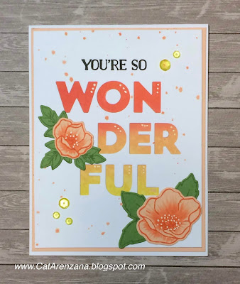
For the next card, I used some of the individual stamps that are in the set and the die for the word "Wonderful."


First, I die-cut the word from a white panel measuring 4" x 5 1/4".

Next, I blended Ripe Persimmon, Wild Honey, and Mustard Seed Distress Oxide Inks onto a separate white panel measuring 3 3/4" x 5".

I then stamped the flowers in Ripe Persimmon ink onto Peach Bellini Card Stock by My Favorite Things and added some shading using R02 Copic Marker.

The leaves were stamped in Pistachio Memento Ink onto Gumdrop Green Card Stock, also by My Favorite things.

After I die cut the flowers and leaves, I adhered the white panel over the blended ink.  Then I arranged the flowers to my liking and glued them down.

I thought there was a lot of white space, so I splattered some Ripe Persimmon ink to break that up a bit.  Then I adhered that to a Peach Bellini panel measuring 4 1/8" x 5 3/8" and stuck it to a white card base.

I thought it needed some bling so I added a few yellow sequins.  I finished it off by stamping the sentiment in black ink and added some white highlights using a white gel pen.  And there ya have it!  A second card using the same stamp and die set that is very different from the first.


Thanks for stopping by today!

Friday, August 17, 2018

Bloom Wildly

Oh, hi!  How's the weather where you are?  It's sort of starting to cool off here . . . Mid to Low 90s.  I am so ready for Fall.  so.very.ready.  And with Fall on my mind, I chose a Fall-ish color palette for this card.  I do love teal, orange and yellow together.

{Supplies used are linked in the text in this post.
Compensated affiliate links may be used at no additional cost to you.
Thank you for your support!} 
Obviously that's a whole lotta Copic coloring going on. . . but you guys, when a fabulous company offers a free digital stamp and another fabulous company offers a free class to learn how to color that digital stamp . . . well, you jump on that!

I have learned so much good stuff in this class offered by Kit & Clowder!  And the Kindness is the Way digital stamp set by Power Poppy is beautiful.  BEAUTIFUL!

I totally encourage you to check it out. . . did I mention that it's free?  As in, Zero Dollars.

Okay . . . on to the card.  I printed out the daisy background onto Neenah Solar White card stock.  I've always been afraid of digital stamps.  But you know what? This was super easy to download and you can even re-size the images.  By the way . . . there are a couple of different images in this digital set.

I colored (for days and days) using Copic Markers and when I was all done, I thought, "Well now. . . what am I going to do for a sentiment?? I don't want to totally cover up all that work."  Lucky for me, I had just watched a video by Jennifer McGuire where she used a frame with vellum so the background would be muted, but not covered up.  Perfect.

So, I cut three frames using the Large Classic Squares and Small Classic Squares Nestabilities dies from Spellbinders.  I stacked the frames just to give it a bit of dimension.

Then I stamped and embossed the sentiment from the Pure Prairie Spirit stamp set onto Vellum using VersaMark ink and White Embossing Powder.  I used the larger square die to cut the vellum so it would fit behind the frame perfectly.

Copics used: YR12, YR14, YR18, B00, B53, B57, Y08, Y11, Y13, Y15,
E23, E37, E29, E79, BG0000
I did use foam tape behind the frame for some extra lift.  Here's a hint . . . cut the foam tape in thin strips and only adhered it to the card stock frame.  I also used foam tape on the daisy panel. . . because, you know me. . . I love my foam tape!

Finally, I adhered that to a dark teal panel and then onto a white card base.  And there ya have it. . .


Thanks so much for stopping by today!

Wednesday, August 15, 2018

Tropical Sunset

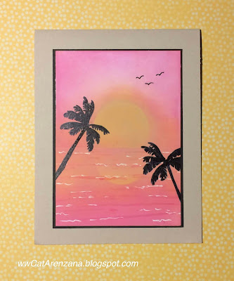
And now for something different. . . no markers.  Okay, okay . . . I did use a marker to color in the palm trees to make them silhouettes.  And to add some "waves" in the water.  And to draw the birds, which were drawn in because somehow I managed to smudge ink in that corner.
{Supplies used are linked in the text in this post.
Compensated affiliate links may be used at no additional cost to you.
Thank you for your support!} 
So, I'm in a Stamp Club and the theme for August is Travel/Vacation.   I thought a nice sunset over the ocean and palm trees would pretty much say "Vacation."  But, every time I tried to come up with something, it ended up in the round file.

A quick search on YouTube and I found this video, which is where the inspiration for my card came from.

I learned a lot while making this card, too.  In the video, she used dye based ink and I wanted to use Distress Oxide Ink.  The bummer is, I used a super smooth card stock instead of Neenah Solar White. By the time I was done blending, not only did my arm get a really good workout, but the card stock was totally saturated with ink.

So, when I stamped and colored the palm trees and added the waves, the ink just kinda sat on top and took a really long time to dry.  Lesson learned.


Overall, I am happy with how it turned out, but next time, I'll definitely use Neenah Solar White.

Here's what I used:

Uni-Ball White Gel Pen
Copic Markers: RV13, 100

Thanks for visiting today!

Tuesday, August 7, 2018

Tropical Feathers

You guys!  More feathers with flowers! I can't even handle it!  I just love how unique these stamps are!  (You can see my previous feather post right here.)

For this card, I chose to use the Tropical Feather:

{Supplies used are linked in the text and thumbnails in this post.
Compensated affiliate links may be used at no additional cost to you.
Thank you for your support!} 
And, since I chose the tropical feather, I had to have a tropical leaves and an extra hibiscus to go with it, right??  After all, the Tropic Fever Stamp Set and Coordinating dies by WPlus9 are a perfect match!

I stamped the feather from the Earth Has Music set onto Neenah Solar White card stock and colored it with Copics.  Once is was all colored up, I fussy cut it.

Next, I stamped the solid leaves and palm fronds using Mowed Lawn Distress Oxide ink.   I added a little bit of shading to the palm fronds with Copics and cut them out with the coordinating dies.

I stamped the background using Scattered Straw Distress Ink onto a white panel and inked the edges with a sponge.  After I arranged all the images and was happy with the layout, I glued them down.  That feather, though?  Oh, it had to be popped up, so I used foam tape for that.

And there ya have it!  A tropical feather card pretty much suitable for any occasion.


Thanks for stopping by today!

Monday, August 6, 2018

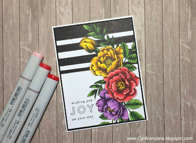
Bold Stripes & Beautiful Flowers

I warned ya I'd be using the Beautiful Flowers stamp set by Simon Says Stamp a whole lot.

And this layout? Totally inspired by Kathy Racoosin's card that you can see right here.

And, this is pretty much a one layer card . . . sort of. Okay, fine, two layers because I thought the stamped panel would look really nice with a thin black mat behind it. Then I adhered that to a white notecard. . . but the notecard doesn't count as a layer, right?

{Supplies used are linked in the text and thumbnails in this post.
Compensated affiliate links may be used at no additional cost to you.
Thank you for your support!} 
I admit I was a bit nervous about drawing in those bold black stripes. Even with a ruler, I have a hard time drawing a straight line.  (I'm sure I've said that before!)  But when I saw Kathy's card, I just had to try it.


I think I held my breath the whole time I was drawing the stripes . . . and coloring them. When I finished drawing and coloring those bold stripes, I got to take a breath.

And then . . . I had to place that sentiment just so.  Yep.  I held my breath for that, too.

All that non-breathing was totally worth it because I'm really happy with how this card turned out.


Thanks for visiting today!

Sunday, August 5, 2018

Simply Camellias

In case you haven't noticed, I'm currently on a flower kick.  So many pretty flower stamps out there!  And flowers are always versatile.

{Supplies used are linked in the text and thumbnails in this post.
Compensated affiliate links may be used at no additional cost to you.
Thank you for your support!} 
When coming up with the layout for this card, I had fully intended on using a background die, but it just wasn't working for me.  I really wanted those flowers to be the focal point.


I did, however, want some sort of background so I opted for patterned paper.  And then I decided that I wanted the patterned paper to be behind the flowers so I created an open frame with dies.


And I finished it off with a few clear sequins.

Thanks for stopping by today!

Here's what I used:

Simply Camellias by Power Poppy

Saturday, August 4, 2018

One Layer Wonders - Day 5

A little bit of masking, a whole lot of coloring, and then using a ruler.  Oh mylanta . . . It took me 2 days to work up the courage for that.  TWO days.  I don't get along with rulers. Or, it could be that every ruler I own (and I have quite a few) is actually crooked because I can't draw a straight line with one.  Seriously.  Even with my clear ruler. . .I line up all the lines and my line still comes out crooked.  Am I the only one?

Anyway. . . here's my card from Day 5 of class:

{Supplies used are linked in the text and thumbnails in this post.
Compensated affiliate links may be used at no additional cost to you.
Thank you for your support!} 
That super fluffy peony is part of the Abundant Petals set from Power Poppy.  It is ginormous! And perfect for a card like this.  Actually, it's pretty much perfect for anything.

So, back to the ruler thing. . . those black label looking things aren't labels at all. Part of the lesson was to create a "label-look" and if ever I get over my fear of rulers, I'll probably be trying that technique again.


Now then, since those peonies are so big and fluffy, I wanted a really nice bold sentiment.  And the Wonderful Florals set by Concord & 9th fit the bill!  And the best part?  Each word is a separate stamp.  No surgery required!  And, using a stamp positioner made it really easy to line up.

The Copics I used are linked below.

Thanks so much for visiting today!

Friday, August 3, 2018

One Layer Wonders - Day 4

Seriously you guys . . . this is a fantastic class!  Especially if you're looking to stretch those creative muscles and try something new.

This class was about using neutral markers for shading multiple colors on an image. . . and a bunch of other good stuff too.

I learned that this particular technique is something that I definitely need to practice.  I think it is an amazing look, but I totally over-blended the colors.  However, with that being said, I'm pretty happy with how this turned out since this was my very first attempt with this technique.

{Supplies used are linked in the text and thumbnails in this post.
Compensated affiliate links may be used at no additional cost to you.
Thank you for your support!} 
Obviously, there was a whole lot of masking going on, which is something that I used to do way back when and then it kinda just went by the wayside.  I had forgotten how much I really like the look of masked images.

To create this bouquet, I used the Abundant Petals set by Power Poppy and the Beautiful Day set by Altenew.

I stamped all of the images in Tuxedo Black Memento Ink.  The sentiment was stamped in Onyx Black Versafine Ink.  For this card, I didn't use Neenah Classic Crest like I usually do.  I decided to use a different card stock because of the ink blending up in that top left hand corner.


Oh, HELLO!  The ink blended like butter on this stuff!  So, if you have a hard time blending dye based inks, including the Original Distress Inks, run! Don't walk . . .RUN and go get yourself some Cougar White Super Smooth Cardstock.  It's also really good for Copics.

Anyway. . .  to do that blending in the upper left corner, I used Frosty Pink Altenew Crisp Ink with a Mini-Ink Blending tool.  To get that sparkle, I splattered a bit of Perfect Pearls a la Kelly Latevola.

So glad you stopped by today!

Thursday, August 2, 2018

One Layer Wonders - Day 3

Whoooooeeeee!  Talk about stepping out of my box!  Oh, yeah, this technique threw me miles and miles away from my comfort zone.  But, that is why I'm taking this class, right??

So, watercolor. Yeah. . . it is not one of my crafty strengths.  I really struggle with it because I feel like I have no control over what is happening.  However, during the video, Kelly said this, "Stay in your lane."

It was hard.  Really hard.  But, I did it (granted, it was only because I made myself get up and walk away from the craft table).

{Supplies used are linked in the text and thumbnails in this post.
Compensated affiliate links may be used at no additional cost to you.
Thank you for your support!} 

And ya know what? I actually enjoyed this technique.  So much so, that I just might even be brave enough to try it again.

This technique has also taught me patience because I had to wait for it to dry. . . I don't really like to wait for things to dry, so Yay, me! I didn't pull out the heat tool to hurry it up.

Here's what I used:
Cheerful Bloom by Prima Marketing
Sentiment from Beautiful Flowers by Simon Says Stamp
Picked Raspberry Distress Oxide Ink
Carved Pumpkin Distress Oxide Ink
Squeezed Lemonade Distress Oxide Ink
Peacock Feathers Distress Oxide Ink
Twisted Citron Distress Oxide Ink
Onyx Black VersaFine Ink
Canson XL Watercolor Paper
Copic Markers - C1, C3, C5, R55, YG01, Y08

Thanks for stopping by!
10